I got a bit tired of people trying to shut down any discussion about AI with “we really need to think about the environmental impact”. So to win an argument on the internet, I did a bit of research and some basic multiplication, and came to an interesting conclusion:
For a given paragraph, ChatGPT uses less energy to generate it than your laptop does while you type it.
To explain that briefly, we published something on our start-up (plinth) blog. The logic is quite simple: back-calculating the energy usage of a marginal paragraph by using the price per token of the API.
Thanks for reading Not Fun at Parties! Subscribe for free to receive new posts and support my work.
But to really hammer this point home, we also made a quick game where you can try and be more energy efficient than the AI (by typing fast):
The blog post was quite short, and did quickly brush over a few things that it would be good to look at in more detail, so here essentially are the footnotes:
Footnotes:
1. Fixed cost of training the models:
The calculation was done entirely on the basis of a “marginal paragraph” — ignoring the energy used to train the model in the first place. This makes it much easier to get a straight comparison. Once you include the fixed cost, the average cost per paragraph decreases the more you use it. So if the model already exists, it’s almost a waste not to use it. But the more interesting question is should you have trained the model in the first place (from an energy usage perspective)?
The best (most commonly cited) estimate of energy usage I could find was from GPT-3, saying it took 936 MWh to train the model in 2020. That’s quite an outdated model, so it would probably take more energy to train something newer. However, given that training costs keep falling 70% per year, we’ll use the ~1 GWh figure as a rough benchmark for ChatGPT-quality models.
As this Hacker News comment points out, that’s not that much. It’s less than a single long-haul flight. But to bring it back to our toy example, how does that compare to the energy usage of laptops?
Apparently, the average laptop releases ~300kg of carbon in its manufacture. With a 500g of CO2 per kWh of electricity generated (in China), that’s 600 kWh per laptop. Or put another way, you can make ~1,600 laptops for the same energy as training an LLM.
Given that ChatGPT has 100 million + users, and a fair number of businesses are using it to replace the need to hire more people in certain admin roles… it’s probably accurate to say that it’s reduced the need for buying laptops by significantly more than 1,600. You could understand why no one is particularly keen to publicise this argument though.
2. Laptop power usage:
In the original post/game, I used 50W as the power usage of a laptop. A couple of people have queried this figure as unrepresentative. It turns out they all use Macs (I’m still on a filthy Windows machine with a massive power adapter). I struggled to find energy usage statistics by laptop model, but it does seem just from comparing power usage and charger sizes in the office, that Apple machines are dramatically more energy efficient? If anyone has some good statistics for this, I’d love to see them.
3. OpenAI’s margin:
I assumed that OpenAI was making 0% operating profit from the GPT3.5 models through their API. This is probably unrealistic (though I could see an argument for them releasing it at a loss and betting they can improve efficiency through economies of scale to get to breakeven/profit).
However, with the way the calculation works, if you assume they make a >0% margin, the relative energy usage of the AI model in the calculation improves (since we’re assuming 40% of the cost goes on electricity. If OpenAI is also taking a margin, the amount of electricity bought for the same fixed price falls).
4. Other models / complex prompts:
The calculation was done on the basis of the newer GPT3.5 models. GPT4 is ~20x more expensive through the API. By the same logic, GPT4 does use ~10x more energy than the average person typing on an average laptop. Hopefully that falls soon.
I also used price per output token — implicitly assuming there’s no significant prompting of the model. Based on the work we’ve been doing ourselves to put AI into production, that seems pretty unrealistic. By the time you’ve started with RAG, or even just some basic prompt engineering, we often end up with massively long prompts, and sometimes chaining multiple prompts together.
This definitely increases the cost and energy usage, but comparing back to a person on a laptop, is probably analogous to a person researching on the internet or thinking about what to write.
5. Energy usage vs carbon emissions:
I suppose there is an argument that comparing energy usage of LLMs to laptops isn’t as useful as comparing the carbon emissions directly — that is, if you think electricity used by OpenAI’s data centres is significantly more or less carbon intensive than the energy to your house/office.
Going back to our carbon intensity map from earlier, that probably is a fair comment if you live in Iceland, Norway or France, given that their electricity is 5-10x cleaner than the USA. It’s definitely less true otherwise.
However, though it’s hard to know how much of this sustainability page is baseless green-washing, it does seem that data centre companies are more-focused-than-average on reducing the carbon intensity of the energy they use. I’m not sure how much that impacts the calculation, but seems to point towards being in favour of the LLM models.
6. Jevons Paradox
Maybe making it so quick and easy to write text will encourage people to do it more? So the overall impact will be an increase in energy usage? It’s not a new thought — William Jevons first mentioned it in 1865. And it’s probably true? I’ve asked ChatGPT to rewrite grant applications in the style of a sarcastic pirate. I doubt I’d do that on my own time.
But, if we end up using a bit more energy to get a lot more done, isn’t that a good thing? We’d all get to spend more time and effort working on other things. Maybe it could remove the hassle of filling out 100s of pages of pointless planning documents for building new solar farms? Or maybe we could spend less time doing admin, and more time enjoying life? Either way, seems pretty great.
7. Other future developments
Maybe things will improve even faster than we expect? The new hardware model from Groq seems to be stupidly fast for LLMs. I’m guessing we’ll see more similar developments to really reduce these costs.
Thanks for reading Not Fun at Parties! Subscribe for free to receive new posts and support my work.
Instructions: The Wordle Solver gives you a suggestion. Type this suggestion into Wordle. If you disagree with the suggestion (how dare you), you can change it by clicking on each letter. On the Wordle Solver, click the coloured buttons underneath each letter that matches the feedback you got from Wordle (e.g. Grey, Yellow or Green). The Wordle solver will give you a new suggestion. Repeat until solved.
Disclaimer: You can 100% beat the Solver. It basically never solves the word by the second guess. It pretty much always does it in 4 or 5 though.
A bit of background
If you’ve been on Twitter at all in the past week, you might have seen a bunch of random green, yellow and grey squares, accompanied by some kind of numeric code.
I did my first one yesterday. I thought pretty well. But as it turns out, my partner beat me, which irked. So I was determined to write some kind of algorithm to do the relationship ruining work for me.
Solver strategy
When I did pretty poorly on my first try, I had a quick look for some “strategy tips”. I found this article in the Sydney Morning Herald, with the following advice:
Unfortunately, this is pretty dumb.
But by looking through Twitter, it’s definitely advice most people follow. If you go through different people’s guessing process, you see a steadily accumulating number of green squares as they gradually fine tune their answers.
It’s much better to swing violently from one extreme to another. To try and eliminate as many potential letters and words as quickly as you can. It’s a bit like playing “Guess Who?”.
Or indeed, like some kind of search algorithm…
Writing some kind of search algorithm
I’ve not done this before, so this was fun.
I started with the intuition that at each step, I wanted to eliminate as many words as humanly possible. Clearly, if you guess something like “QUIRK” or “FUZZY”, you’re going to eliminate a lot of words if you get a “Q” or a “Z” correct. But that probably won’t happen. You need to balance the number of words you can eliminate by getting a letter correct with the probability that the word you’re looking for will actually have that letter. Ideally, like in “Guess Who?”, you want your guess’s letter to split the words in half.
For one letter, it’s quite easy to visualise how much better some guesses are than others at splitting the “match vs not-matched” words equally. This is how many words from Wordle’s list start with an “E” (green), have an “E” somewhere else (yellow) or don’t have an “E” (and the same for “Z”):
Guessing “Z” is great iff the word happens to be “Zebra”, “Zesty” or “Zonal”.
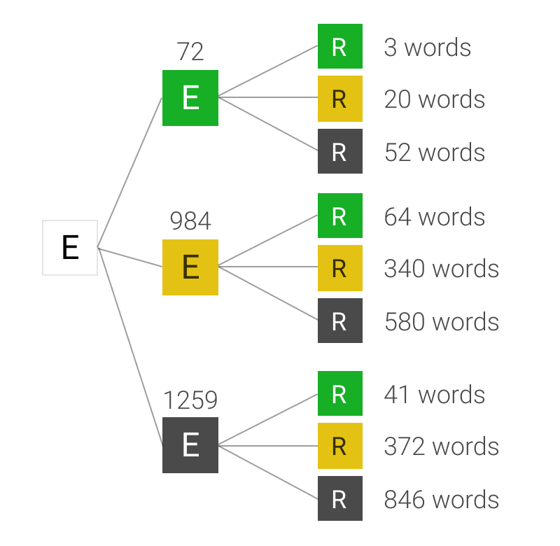
It gets a little bit more complicated when you have to create a whole word. You need to start combining the value of multiple letters - and not just the letters themselves, but the order and position of letters within the word. One way to do this is to start assembling some kind of tree diagrams for each word, like this one:
You can fill in the remaining letters
For the first letter, then the second letter, and so on onto the last one, you work out how many words fit all the potential results. For example, how many 5 letter words exist that have neither an “E” or and “R” in them? 846 (according to Wordle). How many start with an “E”, have an “R” in them, but not as the second letter? 20.
If you build these trees out for all five letters, for potentially 243 different paths, you get a measure of the number of words that fit into each bucket. This means you can work out how many words you would expect to have left over if you made this guess.
Assuming that Josh chooses the word from the list randomly, the chance of Wordle giving your guess a particular sequence of 5 colours is equal to the number of words that end up at the right hand side of the tree divided by the total number of words in the list. Again, this example of 2 letters is useful:
Spot the rounding error
Once you’ve done this, you have the probability of every possible response from Wordle to your guess, as well as how many words would fit each possible clue. If you multiple them together and add them up, you get the “expected words remaining” after your guess. Calculate that for every word in the list, take the lowest one, then guess that word.
You can use this method to calculate the best possible first guess for every game. The answer: “RAISE”1. After that, you need to use the feedback from previous words to change your guess (obviously). Fortunately, you can use exactly the same method. You just need to first filter the list for all the words that could potentially match the previous results.
You could try do all these 562,575 calculations in your head, but fortunately, I have a computer and I can write a bit of hacky JavaScript. This code (which powers the solver), goes through all these steps for each letter, each word and each guess.
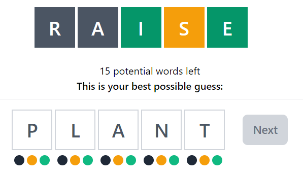
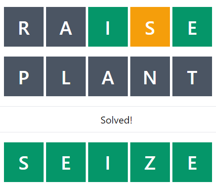
If you play with the solver, you can see how the code leads to some pretty interesting guesses. For example, if the word you’re trying to guess is “SEIZE”. After the first guess, you’ve got a pretty good idea of a lot of the letters, and the code says there’s only 15 possible words left. At which point, it recommends guessing “PLANT”, even though that can’t possibly be correct.
But, eliminating all these letters means that by the next word, there’s only 1 possible answer left:
In general I think it’s pretty cool how quickly the words get narrowed down. Even just by using “RAISE” as the first guess, you eliminate almost 98% of potential words on average.
It would be fun to go through all the words and work out what the most difficult potential answer would be. I’ve not found any that take more than 6 guesses, but would be very interested to see if anyone else can.
Going through the code
If you’re the kind of person who likes reading code snippets, this might be interesting. However, I’m pretty sure you could make this code a lot better, and certainly a lot more performant.
There’s 2 or 3 “clever” bits that are the most interesting.
Firstly, a function to filter the word list based on all previous criteria:
const matchesFilters = (wordList, filters) => {
  return wordList.filter((word) => {
    let match = true;
    for (let i = 0; i < filters.length; i += 1) {
      const { colour, position, letter } = filters[i];
      if (colour === "black") {
        if (word.includes(letter)) {
          match = false;
          break;
        }
      }
      if (colour === "green") {
        if (word[position] !== letter) {
          match = false;
          break;
        }
      }
      if (colour === "yellow") {
        if (!word.includes(letter) || word[position] === letter) {
          match = false;
          break;
        }
      }
    }
    return match;
  });
};
Secondly, a couple of functions to recursively create those probability trees:
I did write in the code a way to do this on “Hard Mode”
If anyone finds this option more spiritually fulfilling, I can add that into the UI for you.
I had quite a lot of fun doing this. If you liked it, you can subscribe to see more of this kind of stuff (at least once per year!).
Alternatively, you can say hi to me on Twitter, or if you want to know more about what I do building tech for non-profits at plinth feel free to get in touch.
As it turns out, Wordle seems to have 2 word lists. One with ~2000 normal words, and one with 13,000 other random words I’ve never heard of (which is where the first screenshot of the solver is drawing from). Currently the solver is set to only guess vaguely sensible words (which works generally better - but you might be able to speed up the first step by guessing one of the extra 13,000: “LARES”). I suppose the optimum solver would use all 15,000 allowed words in order to guess the best possible option from among the ~2,000 normal words.
Last week, after months hovering around 0-1%, America's official inflation rate jumped sharply up to 2.8%. For a lot of people, that was a long time coming. There have been suspicions for years that the official inflation rate is somehow not reflective of the "real world" — that while inflation has been low, the actual cost of living has been increasing.
(Btw, do not search for “inflation” on Twitter. I promise you will regret it.)
Clearly criticising inflation calculations is nothing new. More in depth criticisms range from sensible questions about the goods and services considered, to crackpot theories about government cover-ups. Some of the first category are worth looking at, especially around the question of how to include housing, but for the rest of this I'm going to focus on something I don't see mentioned as often.
You're (maybe) not average
If an economist tells you “wages have increased”, the appropriate response is to ask “Whose wages? Mine haven't.” We're all well aware that increases in an average don't necessarily mean an increase for a particular individual. But when it comes to inflation, we seem to forget that. The reported national inflation rate is an average of the price increases of a variety of goods and services. The "shopping basket" is chosen to be representative of the country as a whole, but that doesn't guarantee it applies to you.
If the price of children's clothes increases, but you have no kids, you won't be affected. Similarly, if you don't have a car, an increase in the price of petrol (gas) isn't going to hit your wallet directly. If you take all these price changes together, you get your own "personal inflation". In fact, in 2010, the BBC published a "personal inflation calculator" that you could use to work this out. The national inflation rate is an average of all these rates — so obviously there will be some people for which "their inflation" is much higher than the reported rate — something that is rarely mentioned.
GDP is to wages as inflation is to...
Of course, this is really just being pernickety. The inflation rate isn't really designed to be used as an estimate of the changes in the cost of living. It's designed as a tool to support Central Banks with their monetary policy. Much like measure of GDP per capita is a good measure of long term national prosperity, inflation is a good measure of average changes in the purchasing power of money. However, for measuring short term fluctuations, or for looking at outcomes of specific groups, national average inflation may not be the best metric.
In general, to be a good measure of cost of living changes, the inflation rate needs to measure the change in consumer prices for a "typical household". If there is random variation — some people experience more inflation than the official rate one year, and then less the year after — that's to be expected and not a particularly big deal. However, if there is systematic bias — if inflation for one group is always different from the national average (and different in the same direction), that's a much bigger problem...
Plutocratic bias
Once you start thinking of inflation as an average, you might start to wonder what kind of average. How do statisticians take the all prices of this "shopping basket" and collapse them into one number? Between products, how important is a change in the price of bread compared to the price of cat food? Across people, if everyone has their own "personal inflation" reality, do we treat everyone equally? Or do we give more weighting to the people who spend more?
In the UK, the answer to both these questions is the same. (I am going to use UK figures for the rest of this because the UK's Office of National Statistics is so good —they report all their assumptions, underlying data and methodology issues in nice clear language. But the rest is true for all the CPI calculations I’ve seen across other countries) For each item in the shopping basket, the ONS (the "Office of National Statistics") calculates a "weighting" — the proportion of total national expenditure spent on that item. The annual price changes are multiplied by these weights to come to one final figure. For example, £0.22 of every £1000 spent in the UK goes on cigars. So they get a weight of 0.022%. And so if cigars double in price, inflation increases by 0.022%. As a result, the more you spend, the more important you are to the calculation.
Calculating the weightings in this way does make a difference. In 2015, the ONS wrote a paper to work out exactly how much. They recalculated inflation as a straightforward average "one person one vote" style, and then compared it to the weighted method they normally use. The result: for 15 years, with a few rare exceptions, the reported rate was consistently lower than the inflation experienced by a typical household.
The normal rate is labelled "Plutocratic Inflation", with the straightforward average as "Democratic Inflation"
While the average difference across this period (0.33 percentage points) doesn't sound massive, it compounds. Each decade, the median household's wages "adjusted for democratic inflation" are ~3% lower than the real wages typically reported.
Why is this?
The rich don't spend their money on the same stuff as the poor. You don't see many aristocrats at Poundland, and you don't see many shift workers in the business class seats. In Britain, the poorest 10% spend 42% of their total expenditure on food. The richest — just 25%. In general, the poorer you are, the more money you spend on necessities, and less on luxuries. If the price of necessities are consistently increasing faster than the price of luxuries, inflation will always be higher for those on minimum wage. This becomes particularly important when you consider Baumol's Cost Disease.
Suppose in some underdeveloped economy, people can choose either to work in a factory or join an orchestra, and the salaries of factory workers and orchestra musicians reflect relative supply and demand and profit in those industries. Then the economy undergoes a technological revolution, and factories can produce ten times as many goods. Some of the increased productivity trickles down to factory workers, and they earn more money. Would-be musicians leave the orchestras behind to go work in the higher-paying factories, and the orchestras have to raise their prices if they want to be assured enough musicians. So tech improvements in the factory sector raise prices in the orchestra sector.
Now, look at this graph:
TVs, Toys, Software, Cars and Clothes are all industrially manufactured goods with continuous productivity improvements. They are also the kind of things you buy more of when you're rich. Healthcare, Childcare, Housing and Food are typically labour intensive — for now at least, you still need real people involved in all of these. They are also the kind of things almost everyone needs to buy, and as such are a much higher proportion of a poorer household's budget. While Baumol as a rich academic first noticed his Cost Disease in orchestras, it's far more important for a country's essentials than its symphonies.
I think this gives a nice theoretical explanation for why people are suspicious of inflation calculations. Because of Baumol's Cost Disease, the price of labour intensive essentials are increasing much faster than TVs and software. For most people, these essentials are a significant proportion of their budget. However, the richer you are, the more you spend on other things that are continually decreasing in price. And, the richer you are, the more important you are to the overall inflation calculation, because you get a weighting based on your expenditure. As a result, inflation rates systematically underestimate increases in the cost of living for a typical household.
At the extremes
The graph from the ONS earlier showed in difference in average inflation rates calculated in two different ways. At the extremes of the distribution, the difference is likely greater still. This is particularly important, because we often use “inflation adjustments” to answer questions like "How has the real minimum wage changed over time?" or "How much should inflation-linked benefits increase each year?".
For example, if we take this graph of showing the Federal Minimum Wage in the United States “adjusted for inflation”:
If US inflation patterns are similar to the UK, we already know we need to subtract at least an extra ~3% from that top orange line every decade because of the difference in plutocratic and democratic inflation averages. (Or, to put it another way, at least $1.15 between 1970 and 2016.) However, people on minimum wage are, pretty much by definition, not in the middle of the income or expenditure distribution, so we probably need a bigger adjustment. But how much bigger?
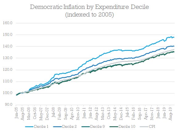
In the UK, the ONS outdoes itself. It publishes detailed CPI calculations for the different subsections of the country, even providing both plutocratic and democratic weightings for each. They split it by retired vs working, households with and without children, as well as providing a calculation for each decile of both the expenditure and income distributions. As you’d expect, the biggest difference is between expenditure deciles:
If the difference in inflation between two groups can be as high as 12% over a 15 year period (or 0.8% per year), this is clearly something worth taking seriously in discussions over benefits, pensions or minimum wages. For people who depend on these income streams, this difference in inflation rates means they may be effectively 8% poorer every decade than is reported in official statistics.
This isn’t as a result of an elaborate conspiracy to cover up “real inflation”. It’s a simple mathematical quirk of the way inflation is calculated that is explained in detail on the UK government website. The problem comes when we use an plutocratic weighted average inflation rate to describe changes in the cost of living, something that measure was never designed to do.
Finally, here's something I made earlier…
Since the promise of this newsletter is a bit of writing combined with a bit of making, I thought it would be fun to revive and update the BBC’s old personal inflation calculator:
Yes, that page does link back here. It’s an ouroboros of inflation content.
It comes pre-filled with some data from the ONS for median households, as well as the poorest and richest 10%. You can also fiddle with the numbers to tell whatever inflation-based story you think will get the most likes on Twitter.
However, it doesn’t work particularly well. It doesn’t go into enough granularity to show any interesting difference between groups. Regardless, I thought it could be of interest to someone so here’s the link: https://notfunatparties.com/inflation.
Each year, humpback whales spend the summer feeding in the fertile waters of the Arctic. When winter arrives, and the fish become scarce, they travel 5,000 miles to their familiar breeding grounds in tropical waters. Similarly, when the posts about Tigers, Miami or VCs’ topless selfies have run dry, ‘Tech Twitter’ returns to the comfort of debating the etiquette of sending a Calendly link:
For the uninitiated, Calendly is a tool that lets you send out a link to someone so they can book a time directly on your calendar, without the rigmarole of the email back and forth. Though other brands are available, Calendly is the biggest and most popular.While it definitely makes life easier, there is obviously some debate on whether it’s a bit rude?
As this blog post nicely summarises, the main problem is that while it may save time in aggregate, it moves all the effort onto the person who needs to book the meeting. As a result, it can come across a bit impersonal. And if you’re the person who is asking for the meeting it’s probably on you to put the work in, so a Calendly link might not be the best option.
So in that vein, I want to offer you a simple alternative. It’s designed for when you really want someone to agree to a meeting — whether that’s a friend with a notoriously packed social schedule or former acquaintances that you want to share excitingbusinessopportunities with. It’s completely free — you can try it out and create your own calendar links without even making an account. (Though if you need any enterprise features, please do get in contact with our sales team.)
Hopefully, this will solve some of your current meeting scheduling problems. And then replace them with completely new ones.
Obviously, we (me, Reda and Reuben) had a lot of fun — mostly just playing around with various CSS transformations. If you liked it, I would also highly recommend the “Bad UI Battles” subreddit. And, if you were wondering where our original inspiration came from, look no further than this incredibly nostalgic piece of internet history:
If you’ve got any fun suggestions, definitely let us know. We’d be up for adding/changing/removing features if anything makes us laugh.
If you enjoyed it, feel free to share it with your friends/colleagues/HR departments.
If you hated it, close the tab.
About Not Fun at Parties:
This “newsletter” is a fairly odd mix of tech, data, economics and stupid stuff (like this). I’m aiming for each post to have an attached “thing I’ve made”, mostly to give me an excuse to try out new tech. If that sounds like your bag, let me send you emails:
Apparently 88,000 people read the last post here. It went to the top of HackerNews, was featured in Morning Brew, Startup Digest, and most amusingly, Money Stuff. Basically, it was a bit crazy. Also, more than 100 people decided to subscribe, which feels like a pretty big vote of confidence after just 1 post. So I guess the pressure’s on for this one…
Last weekend I was recommending books to 3 million strangers on the internet. It’s not a situation I’ve been in before. Setting it up, while definitely easier than selling an NFT, wasn’t completely straightforward. I ended up handwriting HTML and CSS to show book previews in a way I thought made sense.
This gave me an inkling of an idea. And thinking about this gave me an excuse to do 2 things:
Try out Supabase to see if I could built an entirely new app in a weekend
Really go to town on why I don’t like Goodreads.
I don’t want to bury the lede. If you don’t want to read a longish article and just want to try something out, you can sign up to the prototype here: https://copybooks.app.
Recommending books on the internet
On istheshipstillstuck.com, this is what I ended up with when I tried out affiliate marketing:
I wasn’t particularly happy with it, but I didn’t have time to make something better. Firstly, the book list (and its order) was hardcoded. Every time I wanted to change the selection, I had to change my code and redeploy the whole website. That’s the main reason why I ended up with so many commits for what was quite a simple site:
The second “issue” was that this was just me imposing my ranking on the world. It would have been far more interesting if the ranking could have dynamically changed based on which books people were actually clicking on.
Finally, I managed to localise these links so that people with their computer’s language set to “en-gb” would get shown Amazon UK links, while others would get Amazon US links. However, this didn’t always work — a lot of people in the UK just use the default American language settings. It also didn’t account for people not living in the UK or in the USA, which was actually quite a lot of traffic:
Sorry to Germany and Canada in particular
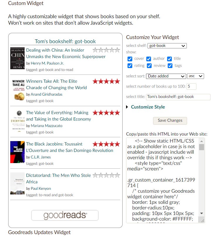
I couldn’t find a useful widget that had all this built in, so I had to make do. But what really confused me was: why on earth doesn’t Goodreads do this?
They’ve made a half-hearted attempt — but you can’t add an affiliate code, you can’t add comments and you can’t easily choose the order:
Yeah, this is pretty much useless. Also, I’ll give you £5 if you can find it on the Goodreads dashboard in less than 30 seconds.
A week later and I’ve been thinking a lot more about how and why Goodreads screwed up…
Goodreads
Look at me. I read books.
CritiquesofGoodreadsare10-a-penny. Most them bang on about on how the UI is dated, how parts of the site are buggy/broken or how the content moderation is a misery for authors. But if that were truly a death sentence for the success of a product, someone ought to write to Craig Newmark, Jeff Bezos or Mark Zuckerberg. Make sure to address it to their butlers.
Goodreads isn’t “broken” because it’s difficult to use. Goodreads never achieved what it set out to do in the first place:
The focus is on finding and sharing. But virtually no one uses it for that. If you ask people how they actually use the site, they say this:
I do find it useful, but not entirely for the way it's intended. The social part of Goodreads is the least important thing to me. I don't belong to groups or seek out friends at the site or utilize any of the recommendations or lists. Mostly it's an organizational tool to keep track of what I've read .
I mostly use it as a glorified list of the books I want to read in the coming time (I LOVE making lists).
I pretty much completely ignore the social-media aspects of the site with the possible exception of occasionally scanning a list or two.
I like it as a personal record, of books I read and how I felt about them.
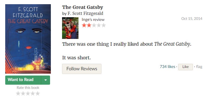
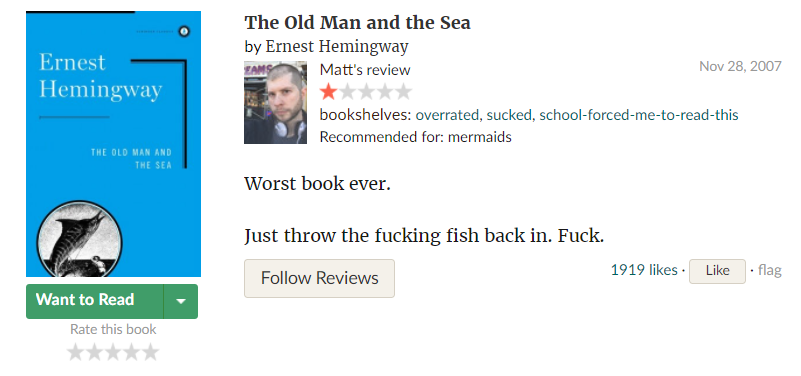
I absolutely detest it as a social media. All you ever see are people posting gifs and extreme reviews long before the books are published. The sheer amount of "I refuse to read this book and it gets 1 out of 5 because nothing can be as good as THE hunger games" are rampant, and even worse they tend to end up as top reviews.
Goodreads wants to be a social network. For most people, Goodreads is a bookmarking tool. That’s why the embed widget wasn’t what I wanted. It was just a public facing progress tracker, not a tool built specifically for sharing books.
Though if the top Goodreads moments start to sound like they ought to be on Twitter… segue time…
A theory of social networks:
I recently read an interesting blog post about social networks called “Status as a Service”. It talks about how social networks compete on 2 things: Social Capital and Utility. By Utility it meant “using this app makes my life easier” (think Steve Jobs’ “bicycle for the mind”). Social Capital essentially means to what extent does the app feel a bit like this:
Here’s a few examples:
Messaging apps (Skype, Whatsapp, Messenger etc.) are high utility, low social capital. Much better than shelling out 12p credit per text, but you can’t really get followers/likes or meet new people.
Facebook is apparently high social capital, low utility. It’s basically useless for your life, but if you post your engagement photos you get lots of likes.
High utility, high social capital apps basically only exist in China: think WeChat.
This is Goodreads, on a graph:
This blue line is Goodreads.
On Goodreads, there are a few people fishing for likes with their reviews, but generally Goodreads doesn’t really have any Social Capital. People just use it to make their life easier.
This is extremely weird!
How we talk about books:
Outside of Goodreads, people talk a lot about their favourite books, and we constantly use them to make judgments about people. If you walk into someone’s house and there’s a copy of Infinite Jest on their table, you know what you’re dealing with:
Likewise, if someone’s book shelf is filled exclusively with Jeremy Clarkson, Stephanie Meyer or Dan Brown, you’re probably making a different kind of assessment. And if it’s exclusively Jordan Peterson? Run.
More generally, recommending a good book gets you some social brownie points. And in a remote-working world, woe betide the talking face with a poorly judged bookshelf:
But Goodreads doesn’t seem to want to engage in any of this. They seem quite happy to just be a fairly useful bookmarking tool. If you ever see someone offering their book recommendations, they won’t be using Goodreads to do it. They’ll create a new page on a website, write a Twitter thread or write a blog post.
What went wrong?
In my view, Goodreads made 2 poor product decisions:
Copying/building on Facebook
Combining recommendations and progress-tracking
You can’t really blame Goodreads for copying Facebook. When the site was founded in 2007, Facebook was the only game in town. Everyone and their dog was building the “Facebook, but for cats”. But that decision has limited Goodreads. While reading is sometimes a group activity (think book clubs or primary school), it often isn’t. To be completely honest, I don’t usually care what my friends are reading. However, I do read the recommendations of people on the internet — I’m not friends with them on Facebook, I follow them on Twitter. I think it makes sense. I generally follow people on Twitter because they are interested in the same things as me, which isn’t necessarily true about my actual friends (nor would I want it to be, I think that would make life quite boring).
Combining recommendations and bookmarking is a stranger decision. For Goodreads to be most useful, I need to use it to keep track of all the books I’m reading — but that means recommendations are an unfiltered mess. In a world where people buy “adult cover Harry Potter” books and where 50 Shades of Grey sold twice as many e-books as physical copies, do people really want their bookmarking tool to be the same as their recommendation platform?
Also, maybe I’m just not interested in everything you’re interested in? I like reading books about football (the Fever Pitch kind), about shipping, about tech, economics, business and the occasional historical fiction. I’m guessing you’re not interested in all those genres. But, by encouraging people to create shelves of simply “Read”, “To-read” and “Currently Reading”, grouped only by the star review you give them, Goodreads bundles all this stuff together.
On Hacker News, there’s a meme: “I could build that in a weekend”. This is my attempt at transubstantiating that meme (it is Easter after all). Predictably, it was a bit more difficult than I thought, so I didn’t manage to get as much done as I’d hoped. However, in true “building in public” style, I thought I’d put out what I’ve got and see what happens.
Essentially, it lets you create a set of book recommendations and then share them:
In the same way Goodreads rips off Facebook, copybooks “draws inspiration from” Twitter. All the recommendations are public. I’m also working on building in a Twitter integration so you can see recommendations most relevant to your interests. Getting back to the original point, it also has a nice embeddable widget for blogs/websites:
It’s not looking to be a straight replacement for Goodreads. There’s no bookmarking, there’s no 5-star reviews (it has rankings instead) and it doesn’t have a list of every book under the sun. Hopefully though, it will have an interesting curated selection from some interesting people.
Who might those interesting people be? I’m not that worried about getting Bill Gates to sign up (though I guess that would be cool?). I’m most interested in the niche bloggers that include book recommendations at the end of every post. Or perhaps the university lecturer that creates a reading list for their course but wants to make it publicly accessible. Maybe even startups who have a reading list for new hires? And for the Substackwriters with interesting perspectives, I’d like to be able to see some of the books that helped form that viewpoint.
By deliberately avoiding a comprehensive database and ML recommendation algorithms, I’m hoping this might work without a significant time investment. In an industry where the stone has been thoroughly bled dry by you know who, this seems like pretty much the only option.
You can give it a try here: https://www.copybooks.app (and please do!). It’s completely free for now — if it seems like people like it, I’ll look into what kind of “premium” features I can add. The code is open source, though this is very much a spare time project for me, so don’t expect too much community management (I also don’t really know how to do that).
Supabase is pretty new. They bill themselves as “The Open Source Firebase Alternative” and they talk a lot about how quickly you can get up and running. They’re not wrong. It was definitely the easiest way of getting set up with authentication and a relational database that I’ve ever tried (for comparison, I had a play with Hasura earlier this year and Supabase was 10 times easier).
As with Firebase, Supabase lets you build a fairly complicated app without a server. By setting access restrictions at row level, you can directly query (and get realtime updates from) the database without needing to set up middleware to handle connections. This, combined with static site hosting, storage, out of the box authentication and serverless functions for sensitive processes (apparently coming soon for Supabase), makes both Firebase and Supabase pretty good options for getting something up and running in a weekend.
How does it rank as a Firebase alternative though? I have a few years’ experience with Firebase, and now a whole 3 days experience with Supabase, so I am at least half-well-qualified to make a judgment on the comparison. Right now, I would say that Firebase just about edges the developer experience. Their tight integration between the functions, the database and the authentication makes development very fast. The docs, examples and extensions are also much more developed (as you would expect for a mature product). Supabase is very cool, but you quite quickly run into some irritating bugs when you try do something slightly more complicated. If you’re looking to build something fairly simple quickly, and you’re comfortable with NoSQL world, Firebase will do the best job for you today.
However, I don’t think that will last long. Firebase is definitely progressing at a slower pace and has some clear limitations that I can see Supabase smashing through mostly by virtue of building on top of PostgreSQL .
For example:
Since it’s NoSQL, Firebase can’t do joins so you end up denormalising a lot, and often making multiple queries to fetch related data.
Firebase doesn’t have any GIS capabilities, so you can’t do any location based analysis.
Firebase has no way of defining a schema (you can sort of hack it together with the rules, but it’s a real ballache)
You can’t do full text search on Firebase. As a result, I tend to use Elasticsearch in combination with Firebase which can get a bit convoluted.
In my view, this is what the future looks like:
About ‘Not Fun at Parties’
Running a newsletter is pretty new for me. I’m not quite sure which direction I’m going to take it in, but my hazy plan is that post will be a mix of product/data/tech analysis and “check out this thing I’ve made”. I’m hoping it will give me an excuse to try out cool tech and write about things a particular kind of person will find interesting. If that sounds like your vibe, be sure to like and subscribe (eurgh).


 are the solutions, but beware the YUKKY IGLOO.")