Last week, after months hovering around 0-1%, America's official inflation rate jumped sharply up to 2.8%. For a lot of people, that was a long time coming. There have been suspicions for years that the official inflation rate is somehow not reflective of the "real world" — that while inflation has been low, the actual cost of living has been increasing.


(Btw, do not search for “inflation” on Twitter. I promise you will regret it.)
Clearly criticising inflation calculations is nothing new. More in depth criticisms range from sensible questions about the goods and services considered, to crackpot theories about government cover-ups. Some of the first category are worth looking at, especially around the question of how to include housing, but for the rest of this I'm going to focus on something I don't see mentioned as often.
You're (maybe) not average
If an economist tells you “wages have increased”, the appropriate response is to ask “Whose wages? Mine haven't.” We're all well aware that increases in an average don't necessarily mean an increase for a particular individual. But when it comes to inflation, we seem to forget that. The reported national inflation rate is an average of the price increases of a variety of goods and services. The "shopping basket" is chosen to be representative of the country as a whole, but that doesn't guarantee it applies to you.
If the price of children's clothes increases, but you have no kids, you won't be affected. Similarly, if you don't have a car, an increase in the price of petrol (gas) isn't going to hit your wallet directly. If you take all these price changes together, you get your own "personal inflation". In fact, in 2010, the BBC published a "personal inflation calculator" that you could use to work this out. The national inflation rate is an average of all these rates — so obviously there will be some people for which "their inflation" is much higher than the reported rate — something that is rarely mentioned.
GDP is to wages as inflation is to...
Of course, this is really just being pernickety. The inflation rate isn't really designed to be used as an estimate of the changes in the cost of living. It's designed as a tool to support Central Banks with their monetary policy. Much like measure of GDP per capita is a good measure of long term national prosperity, inflation is a good measure of average changes in the purchasing power of money. However, for measuring short term fluctuations, or for looking at outcomes of specific groups, national average inflation may not be the best metric.
In general, to be a good measure of cost of living changes, the inflation rate needs to measure the change in consumer prices for a "typical household". If there is random variation — some people experience more inflation than the official rate one year, and then less the year after — that's to be expected and not a particularly big deal. However, if there is systematic bias — if inflation for one group is always different from the national average (and different in the same direction), that's a much bigger problem...
Plutocratic bias
Once you start thinking of inflation as an average, you might start to wonder what kind of average. How do statisticians take the all prices of this "shopping basket" and collapse them into one number? Between products, how important is a change in the price of bread compared to the price of cat food? Across people, if everyone has their own "personal inflation" reality, do we treat everyone equally? Or do we give more weighting to the people who spend more?
In the UK, the answer to both these questions is the same. (I am going to use UK figures for the rest of this because the UK's Office of National Statistics is so good —they report all their assumptions, underlying data and methodology issues in nice clear language. But the rest is true for all the CPI calculations I’ve seen across other countries) For each item in the shopping basket, the ONS (the "Office of National Statistics") calculates a "weighting" — the proportion of total national expenditure spent on that item. The annual price changes are multiplied by these weights to come to one final figure. For example, £0.22 of every £1000 spent in the UK goes on cigars. So they get a weight of 0.022%. And so if cigars double in price, inflation increases by 0.022%. As a result, the more you spend, the more important you are to the calculation.
Calculating the weightings in this way does make a difference. In 2015, the ONS wrote a paper to work out exactly how much. They recalculated inflation as a straightforward average "one person one vote" style, and then compared it to the weighted method they normally use. The result: for 15 years, with a few rare exceptions, the reported rate was consistently lower than the inflation experienced by a typical household.

While the average difference across this period (0.33 percentage points) doesn't sound massive, it compounds. Each decade, the median household's wages "adjusted for democratic inflation" are ~3% lower than the real wages typically reported.
Why is this?
The rich don't spend their money on the same stuff as the poor. You don't see many aristocrats at Poundland, and you don't see many shift workers in the business class seats. In Britain, the poorest 10% spend 42% of their total expenditure on food. The richest — just 25%. In general, the poorer you are, the more money you spend on necessities, and less on luxuries. If the price of necessities are consistently increasing faster than the price of luxuries, inflation will always be higher for those on minimum wage. This becomes particularly important when you consider Baumol's Cost Disease.
From Scott Alexander:
Suppose in some underdeveloped economy, people can choose either to work in a factory or join an orchestra, and the salaries of factory workers and orchestra musicians reflect relative supply and demand and profit in those industries. Then the economy undergoes a technological revolution, and factories can produce ten times as many goods. Some of the increased productivity trickles down to factory workers, and they earn more money. Would-be musicians leave the orchestras behind to go work in the higher-paying factories, and the orchestras have to raise their prices if they want to be assured enough musicians. So tech improvements in the factory sector raise prices in the orchestra sector.
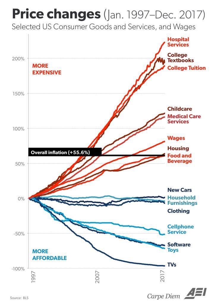
Now, look at this graph:
TVs, Toys, Software, Cars and Clothes are all industrially manufactured goods with continuous productivity improvements. They are also the kind of things you buy more of when you're rich. Healthcare, Childcare, Housing and Food are typically labour intensive — for now at least, you still need real people involved in all of these. They are also the kind of things almost everyone needs to buy, and as such are a much higher proportion of a poorer household's budget. While Baumol as a rich academic first noticed his Cost Disease in orchestras, it's far more important for a country's essentials than its symphonies.
I think this gives a nice theoretical explanation for why people are suspicious of inflation calculations. Because of Baumol's Cost Disease, the price of labour intensive essentials are increasing much faster than TVs and software. For most people, these essentials are a significant proportion of their budget. However, the richer you are, the more you spend on other things that are continually decreasing in price. And, the richer you are, the more important you are to the overall inflation calculation, because you get a weighting based on your expenditure. As a result, inflation rates systematically underestimate increases in the cost of living for a typical household.
At the extremes
The graph from the ONS earlier showed in difference in average inflation rates calculated in two different ways. At the extremes of the distribution, the difference is likely greater still. This is particularly important, because we often use “inflation adjustments” to answer questions like "How has the real minimum wage changed over time?" or "How much should inflation-linked benefits increase each year?".
For example, if we take this graph of showing the Federal Minimum Wage in the United States “adjusted for inflation”:
If US inflation patterns are similar to the UK, we already know we need to subtract at least an extra ~3% from that top orange line every decade because of the difference in plutocratic and democratic inflation averages. (Or, to put it another way, at least $1.15 between 1970 and 2016.) However, people on minimum wage are, pretty much by definition, not in the middle of the income or expenditure distribution, so we probably need a bigger adjustment. But how much bigger?
In the UK, the ONS outdoes itself. It publishes detailed CPI calculations for the different subsections of the country, even providing both plutocratic and democratic weightings for each. They split it by retired vs working, households with and without children, as well as providing a calculation for each decile of both the expenditure and income distributions. As you’d expect, the biggest difference is between expenditure deciles:

If the difference in inflation between two groups can be as high as 12% over a 15 year period (or 0.8% per year), this is clearly something worth taking seriously in discussions over benefits, pensions or minimum wages. For people who depend on these income streams, this difference in inflation rates means they may be effectively 8% poorer every decade than is reported in official statistics.
This isn’t as a result of an elaborate conspiracy to cover up “real inflation”. It’s a simple mathematical quirk of the way inflation is calculated that is explained in detail on the UK government website. The problem comes when we use an plutocratic weighted average inflation rate to describe changes in the cost of living, something that measure was never designed to do.
Finally, here's something I made earlier…
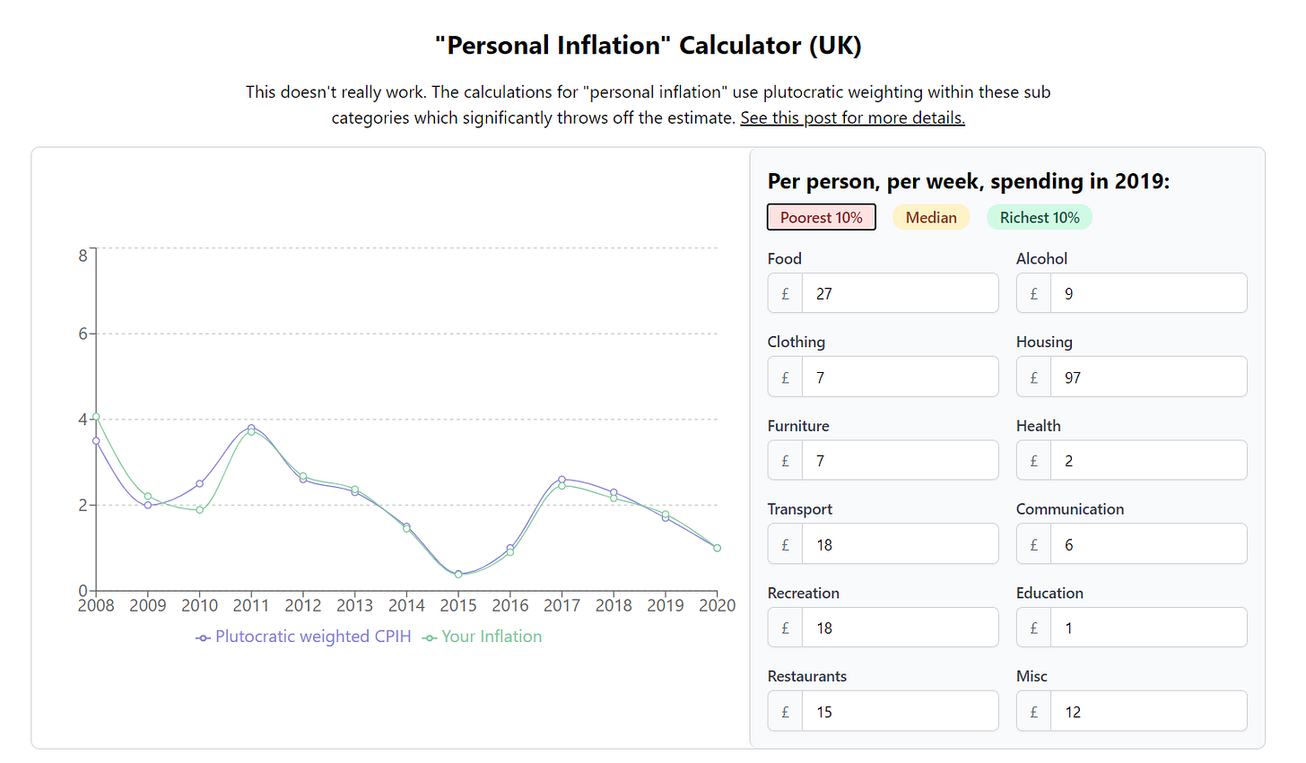
Since the promise of this newsletter is a bit of writing combined with a bit of making, I thought it would be fun to revive and update the BBC’s old personal inflation calculator:
It comes pre-filled with some data from the ONS for median households, as well as the poorest and richest 10%. You can also fiddle with the numbers to tell whatever inflation-based story you think will get the most likes on Twitter.
However, it doesn’t work particularly well. It doesn’t go into enough granularity to show any interesting difference between groups. Regardless, I thought it could be of interest to someone so here’s the link: https://notfunatparties.com/inflation.


